


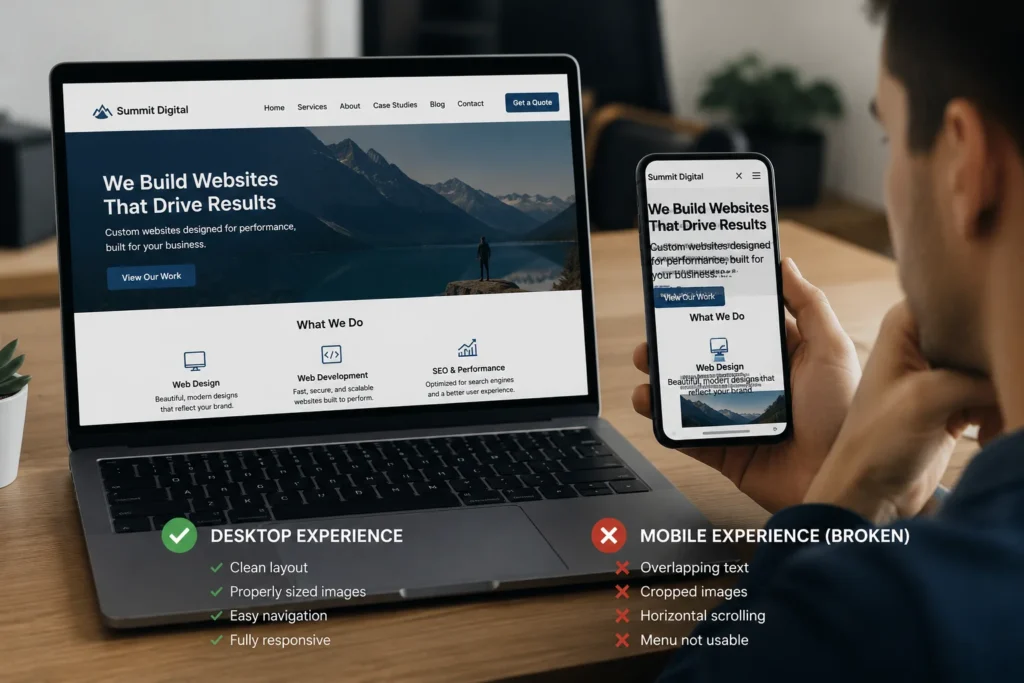
Your website may look polished on a desktop computer but completely different when opened on a phone. Text may extend beyond the screen, images may be cropped incorrectly, buttons may overlap, navigation may disappear, or visitors may need to scroll sideways to read the page.
These mobile website layout issues are common because a website must adapt to many different screen sizes, browser settings, operating systems, and methods of interaction. A layout that fits one desktop width cannot simply be reduced until it fits a smaller screen.
Responsive websites need rules that determine how columns stack, how images resize, how text wraps, and how navigation behaves as the available space changes. When those rules are missing, inconsistent, or overridden by another setting, the mobile layout can break.
Some problems are introduced during the original website build. Others appear later after a new image, heading, form, embed, plugin, custom script, or page section is added.
This guide explains why websites look broken on mobile, how to identify the element causing the problem, which fixes are appropriate, and how to prevent the same issue from returning.
Build a cleaner, stronger website with Xander Web Studio.
Get practical help with your website, from content updates and page improvements to SEO, design cleanup, technical fixes, and launch support.
Key Takeaways
Mobile problems are usually caused by layout rules. Fixed widths, oversized content, missing breakpoints, absolute positioning, and inherited styles commonly cause sections to extend outside the mobile viewport.
One page can behave differently from another. Websites often use several templates, components, plugins, and custom styles, so testing only the homepage is not enough.
Mobile simulation is only the beginning. Browser testing tools are useful, but important pages should also be checked on real phones and tablets.
Hiding the overflow is not always a complete fix. It may remove sideways scrolling while leaving the actual element cropped, inaccessible, or positioned incorrectly.
Mobile testing should follow every major update. New content and design changes can affect responsive behavior even when the request appears unrelated to mobile devices.
Businesses experiencing recurring mobile display problems can request professional website support for responsive testing, page corrections, form troubleshooting, and layout improvements.
What Does a Broken Mobile Website Look Like?
A broken mobile website does not always display an obvious error message. It may technically load while being frustrating or impossible to use.
Common warning signs include:
- Horizontal scrolling
- Text extending off screen
- Images wider than the page
- Cropped faces or products
- Overlapping headings and buttons
- Navigation that does not open
- Navigation covering the page
- Forms requiring sideways scrolling
- Columns that remain side by side
- Excessively small text
- Oversized headings
- Tables extending outside the screen
- Popups that cannot be closed
- Videos breaking the layout
- Sticky elements covering content
- Large blank spaces
- Sections appearing in the wrong order
- Buttons that are difficult to press
- Content that disappears completely
- Layouts that break only when the phone rotates
These problems may appear on only one device or browser. A page can work in Chrome on Android but have spacing or navigation problems in Safari on an iPhone.
The page can also look correct at one simulated mobile width while breaking between common breakpoints. Responsive design must work across a range of widths rather than only a few selected devices.
Google uses the mobile version of website content for indexing and ranking through mobile-first indexing. Google recommends creating a mobile-friendly website and identifies responsive design as a supported configuration.
For that reason, mobile website problems affect more than appearance. They can interfere with customer actions, accessibility, content visibility, and search performance.
Why Desktop and Mobile Layouts Behave Differently
Desktop screens provide enough space for multiple columns, large headings, wide images, detailed navigation, and decorative elements.
A mobile screen provides much less horizontal space. The website must determine which elements should:
- Shrink
- Wrap
- Stack
- Move
- Hide
- Scroll
- Change alignment
- Use a different image
- Use smaller spacing
- Open through a menu
Responsive design uses flexible layouts, responsive media, and CSS rules that react to the available viewport. MDN’s responsive design guide describes fluid grids, flexible images, and media queries as central responsive design techniques.
When a desktop layout is built with fixed measurements and no appropriate responsive behavior, the browser cannot always rearrange it correctly.
A two-column section, for example, may need to become one column on a phone. If both columns retain fixed widths, the second column may be pushed outside the screen.
15 Common Causes of Mobile Website Layout Issues
The following problems account for many broken mobile layouts.
1. Fixed-Width Elements
A fixed-width element keeps the same width regardless of the available screen size.
For example, a section may be assigned a width of 1,200 pixels. That width may fit a laptop but cannot fit inside a phone viewport that is only a few hundred CSS pixels wide.
Fixed dimensions may be applied to:
- Containers
- Images
- Forms
- Videos
- Tables
- Buttons
- Cards
- Sliders
- Popups
- Embedded calendars
A fixed width is not automatically wrong. Some icons, controls, and design elements need specific dimensions. Problems occur when large structural elements cannot shrink or adapt.
Responsive layouts commonly use:
- Percentage widths
- Maximum widths
- Flexible grid columns
- Flexbox
- CSS Grid
- Viewport-aware sizing
- Breakpoint-specific adjustments
A container might use width: 100% with a reasonable max-width rather than retaining the same desktop width on every screen.
When troubleshooting, inspect the widest visible element first. One element wider than the viewport can cause the entire page to scroll sideways.
2. Missing Viewport Settings
Mobile browsers need viewport information to understand how the page should fit the device.
Without an appropriate viewport setting, a mobile browser may render the page using a wider virtual layout and then scale it down. The result can include tiny text, incorrect media queries, or a page that looks like a compressed desktop website.
MDN’s viewport settings documentation explains how the viewport affects page layout and narrow-screen media queries.
A commonly used setting is:
<meta name="viewport" content="width=device-width, initial-scale=1">
Most modern WordPress themes, Webflow projects, Shopify themes, and website frameworks include this automatically. However, the setting may be missing or changed in an outdated theme, custom template, exported project, or manually coded page.
Do not add duplicate viewport tags. Check whether one already exists before changing the document head.
3. Images That Do Not Resize
Large images frequently cause mobile overflow.
An image may have:
- A fixed pixel width
- A minimum width larger than the screen
- An incorrect container
- A conflicting inline style
- A width applied by a plugin
- A large background image
- An unsuitable aspect ratio
- Missing responsive image markup
A common responsive approach allows the image to scale within its container instead of extending outside it.
MDN’s responsive images guide explains how srcset, sizes, and viewport-aware image selection can provide suitable images for different screens.
The visible dimensions and the downloaded file size are separate concerns. An image may visually fit the mobile screen while still forcing the phone to download a desktop-sized file.
The web.dev image sizing guide notes that serving desktop-sized images to mobile devices can transfer substantially more data than necessary.
Check both:
- Whether the image fits the layout
- Whether the browser receives an appropriately sized file
4. Incorrect Background Image Settings
Background images behave differently from standard image elements.
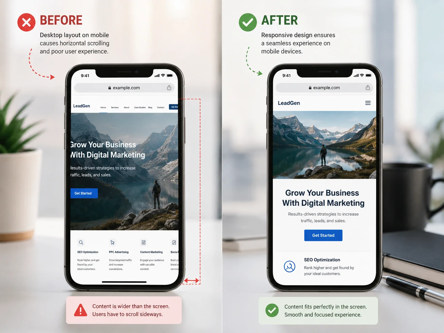
A hero image may look correct on desktop but become unclear or badly cropped on mobile because of settings such as:
background-size: cover- Fixed background positioning
- Center alignment
- Fixed section height
- Desktop-only focal point
- Background attachment effects
The cover setting fills the container, which often requires part of the image to be cropped. On a narrow phone screen, the crop can be much more aggressive than on desktop.
This becomes a problem when important content is near the side of the original image. A person, product, logo, or text may disappear outside the visible area.
Possible solutions include:
- Changing the focal position
- Reducing the section height
- Using a different mobile image
- Replacing the background with an image element
- Adjusting the overlay
- Redesigning the hero composition
A separate mobile image may be appropriate when the desktop and mobile crops require completely different compositions.
5. Columns That Do Not Stack
Desktop websites often use two, three, or four-column layouts.
On mobile, those columns may need to:
- Stack vertically
- Reduce to two columns
- Scroll horizontally
- Change order
- Become a carousel
- Hide secondary information
Problems occur when the desktop grid or flex settings remain unchanged at smaller widths.
For example, three service cards may each retain one-third of a large desktop container. The cards then become too narrow, causing headings to wrap awkwardly and buttons to overlap.
In other situations, each card has a fixed minimum width. The cards remain readable, but the row extends beyond the screen.
Review:
- Grid column settings
- Flex wrapping
- Child widths
- Minimum widths
- Gaps
- Padding
- Item order
- Alignment
- Breakpoint overrides
The correct solution depends on the content. Stacking every column is not always necessary, but each item must remain readable and usable.
6. Excessive Padding and Margins
Desktop spacing can consume most of a mobile screen.
A content section may have 100 pixels of padding on the left and another 100 pixels on the right. On desktop, this creates comfortable whitespace. On mobile, it may leave almost no room for text.
Excessive spacing can cause:
- Narrow text columns
- One-word line wraps
- Very tall sections
- Buttons extending outside containers
- Images becoming too small
- Headings breaking awkwardly
Spacing should usually decrease at smaller breakpoints.
Check for:
- Section padding
- Container padding
- Column padding
- Card padding
- Nested margins
- Negative margins
- Builder defaults
- Utility classes
- Inline styles
Nested elements can create unexpected results. A section, container, column, and text block may each add horizontal padding, producing much more total spacing than expected.
7. Headings That Are Too Large
Large desktop headings can break mobile layouts.
Problems include:
- A heading extending beyond its container
- Individual words being wider than the screen
- Letters overlapping
- Several lines covering the hero section
- Buttons being pushed below the visible area
- Excessive vertical space
The heading may use:
- A fixed font size
- A very large viewport unit
- No mobile override
- Tight line height
- Negative letter spacing
- Unbreakable text
- Long URLs or product names
Responsive typography can use breakpoint adjustments or functions such as clamp() to provide a controlled minimum, preferred, and maximum size.
Font size is only one factor. Review:
- Line height
- Letter spacing
- Text width
- Word wrapping
- Font weight
- Container width
- Alignment
A smaller heading is not necessarily less effective. Mobile visitors benefit from clear hierarchy without having most of the screen covered by one title.
8. Long Words and URLs
Some text cannot wrap naturally.
Common examples include:
- Long URLs
- Email addresses
- Technical terms
- Product codes
- File names
- Tracking numbers
- Unbroken placeholder text
- Long button labels
When a string contains no suitable breaking point, it can push its container beyond the viewport.
Webflow’s text wrapping guide explains how word-break and overflow-wrap settings can help text behave across different screen sizes.
Before applying aggressive word breaking globally, identify the specific content causing the issue. Breaking every word at arbitrary points may reduce readability.
Often, the better fix is to:
- Shorten the visible link text
- Use a descriptive anchor
- Allow long strings to wrap
- Reduce the font size slightly
- Increase the available container width
- Replace the full URL with a button
Descriptive internal anchors such as website fix services are also easier to read than displaying a complete URL inside body content.
9. Absolute Positioning
Absolute positioning removes an element from the normal document flow and places it according to specific coordinates.
This can be useful for decorative shapes, badges, icons, and controlled overlays. It becomes risky when used for major content such as:
- Headings
- Buttons
- Forms
- Navigation
- Entire cards
- Testimonials
- Content columns
A position that works on a wide desktop may place the element outside the screen on mobile.
Common warning signs include:
- Buttons floating over text
- Decorative shapes covering content
- Labels moving away from fields
- Headings disappearing
- Sections with incorrect height
- Elements remaining in desktop positions
Check the positioned element and its containing parent. The issue may come from:
- Fixed top or left values
- Transforms
- Negative offsets
- Incorrect relative parent
- Missing mobile override
- Viewport-based positioning
Whenever possible, keep essential page content in the normal layout flow and use flex or grid alignment instead of manually placing it.
10. Hidden Horizontal Overflow
Horizontal scrolling often means that an element extends beyond the viewport.
Common causes include:
- Fixed widths
- Negative margins
- Transforms
- Offscreen animations
- Large images
- Wide tables
- Embedded forms
- Long text
- Slider tracks
- Decorative elements
Webflow’s overflow guide notes that elements sized or positioned outside the viewport and offscreen interactions can create unwanted horizontal scrolling.
Applying overflow-x: hidden to the page may remove visible sideways scrolling. However, it can also hide part of the broken element.
Use overflow hiding only when the offscreen content is intentionally decorative or when the underlying dimensions have already been corrected.
A proper diagnosis should identify which element is wider than the viewport.
One testing method is to temporarily outline page elements so the oversized container becomes visible. Browser developer tools can also show computed dimensions and overflow behavior.
11. Tables and Embedded Content
Tables, calendars, maps, videos, forms, and external widgets often have dimensions controlled by another platform.
They may include:
- Fixed iframe widths
- Inline pixel dimensions
- Minimum widths
- External CSS
- Desktop-only scripts
- Unresponsive table columns
- Fixed modal sizes
A standard desktop pricing table may not fit a narrow screen.
Possible mobile solutions include:
- Horizontal scrolling inside the table container
- Stacked rows
- Reduced columns
- Priority-based content
- Responsive card layouts
- Smaller spacing
- A mobile-specific display
Embedded content may need a responsive wrapper that preserves its aspect ratio.
The web.dev aspect ratio guide explains how maintaining a consistent ratio can support responsive media and reduce layout movement.
Do not hide important pricing, scheduling, application, or contact information solely because the original desktop widget does not fit. Adapt it or replace it with a mobile-friendly alternative.
12. Mobile Navigation Problems
Navigation often changes more dramatically than any other website element on mobile.
A desktop menu may become:
- A hamburger menu
- A dropdown panel
- A full-screen overlay
- A slide-in drawer
- A simplified link list
Mobile navigation problems include:
- Menu button not responding
- Menu opening behind the page
- Menu extending below the screen
- Dropdowns not expanding
- Links too close together
- Menu remaining open
- Header covering page content
- Logo and menu overlapping
- Menu working on only one browser
- Body scrolling behind the menu
These problems may involve:
- JavaScript errors
- Incorrect z-index
- Fixed heights
- Overflow settings
- Breakpoint styles
- Plugin conflicts
- Duplicate menu scripts
- Accessibility attributes
- Sticky header behavior
Webflow’s navbar guide recommends checking smaller breakpoints and ensuring navigation links are appropriately sized for touch interaction.
Test every main navigation link and any nested dropdowns. Do not assume the menu works because it opens once.
13. Buttons That Are Too Small
Desktop users can select a small text link accurately with a mouse. Mobile users interact with a finger, which requires more space.
Buttons and links may be difficult to use when they are:
- Too small
- Too close together
- Covered by another element
- Partly outside the screen
- Missing visible focus
- Dependent on hover
- Positioned at the edge
- Surrounded by other controls
The web.dev tap target guide recommends making interactive elements large enough and leaving sufficient space around them for mobile use.
Do not solve every button problem by making the text larger. The clickable area can often be increased through padding while retaining readable typography.
Review:
- Navigation links
- Form buttons
- Carousel controls
- Popup close buttons
- Accordion triggers
- Phone links
- Social icons
- Pagination
- Cookie controls
Buttons should also provide clear visual feedback when tapped.
14. Hover-Dependent Features
Desktop websites can reveal information when a pointer hovers over an item.
Mobile devices generally do not provide the same persistent hover interaction.
Hover-dependent content may include:
- Dropdown menus
- Service descriptions
- Image captions
- Tooltips
- Product actions
- Portfolio overlays
- Pricing information
- Interactive maps
If essential information appears only on hover, mobile visitors may never see it or may trigger it inconsistently.
Use tap, click, focus, or visible content for important interactions.
Hover effects can remain as enhancements for pointer devices, but the user should not need them to:
- Understand an offer
- Access navigation
- Read a label
- View pricing
- Submit a form
- Open a link
- Complete a purchase
Media queries can also detect aspects of the user environment, including viewport dimensions and certain input capabilities. MDN’s media query guide provides an overview of applying styles according to device and viewport conditions.
15. Third-Party Scripts and Plugins
A mobile layout may break because of code outside the page builder or theme.
Possible sources include:
- Chat widgets
- Cookie banners
- Scheduling tools
- Review widgets
- Advertising scripts
- Analytics tools
- Popups
- Form plugins
- Accessibility widgets
- Ecommerce applications
- Animation libraries
- Social feeds
A third-party tool may:
- Add a fixed-width container
- Insert inline styles
- Load after the page
- Create a high z-index
- Add a sticky button
- Prevent scrolling
- Conflict with another script
- Fail on a particular browser
Temporarily disabling the suspected feature in a staging environment can help confirm whether it causes the problem.
Do not permanently remove an important integration without understanding its business purpose. The correct solution may involve updated embed code, different settings, CSS containment, or an alternative tool.
Why Mobile Problems Appear After an Update
A website may work correctly for months and then break after a seemingly simple change.
Common triggers include:
- Uploading a larger image
- Adding a long heading
- Changing a button label
- Embedding a video
- Replacing a form
- Adding a new menu item
- Updating a plugin
- Changing a theme
- Copying a desktop section
- Adding custom CSS
- Installing a popup
- Publishing a CMS item
- Changing a component
- Updating a framework
- Modifying an animation
The new content may exceed a limit that the original design never accounted for.
For example, a card designed for a two-word service name may break when the title becomes eight words. A navigation bar may fit until one more link is added. A form may remain responsive until an external scheduling widget is embedded.
Your small business updates guide explains why forms, content, mobile layouts, software, and integrations should be tested after significant website changes.
Why One Page Looks Broken but Others Do Not
Websites often use more than one layout system.
A WordPress website might use:
- A theme template
- The Block Editor
- Elementor
- Custom fields
- A form plugin
- Custom CSS
- Blog templates
A Webflow website might use:
- Static pages
- CMS templates
- Components
- Utility classes
- Custom code
- Interactions
- Page-specific styles
The homepage can work correctly while one service page contains:
- An older section
- A duplicate class
- Inline styles
- A different template
- A custom embed
- An oversized image
- A unique form
- A forgotten mobile override
Test the exact affected page instead of assuming the issue is sitewide.
When the problem appears across multiple pages, identify whether they share:
- The same component
- The same template
- The same CSS class
- The same plugin
- The same embedded tool
- The same global header
A global issue should usually be fixed at its source rather than patched separately on every page.
How to Find the Element Breaking the Mobile Layout
The fastest fix begins with identifying the exact element causing the problem.
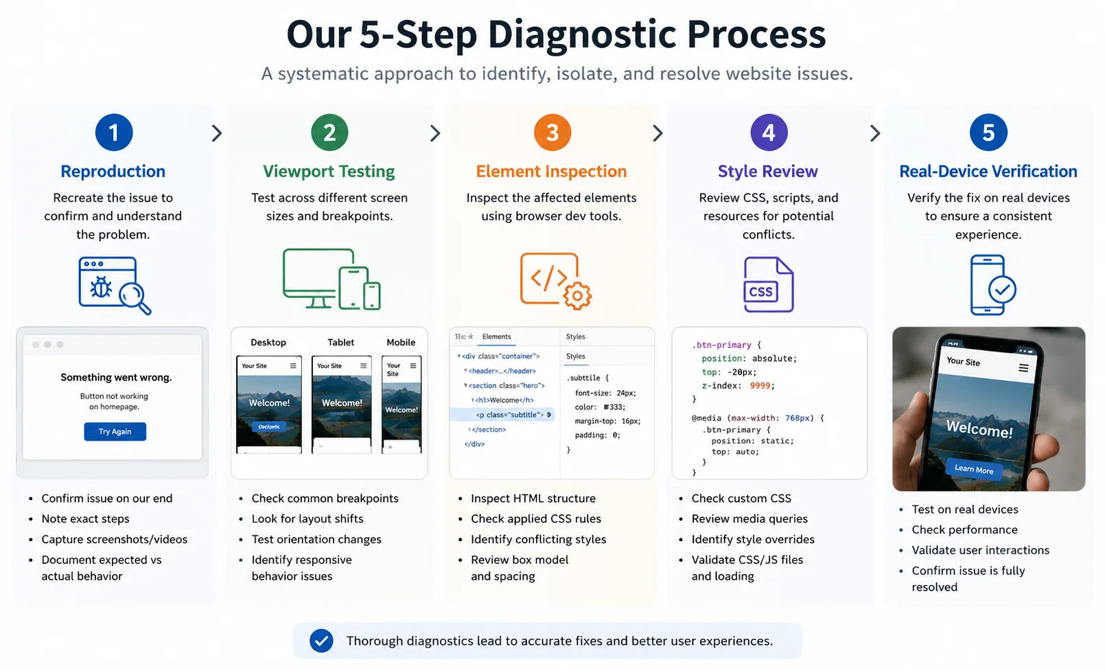
Step 1: Reproduce the Problem
Record:
- Exact page URL
- Device type
- Browser
- Screen orientation
- Whether the issue happens every time
- Whether the user is logged in
- Whether the page was recently changed
Take a screenshot or screen recording.
A report saying “the site is broken on mobile” is difficult to investigate. A report saying “the pricing table scrolls sideways on the contact page in Safari on an iPhone” provides a clear starting point.
Step 2: Test Several Widths
Open the page using responsive browser tools and gradually resize the viewport.
Do not test only preset phone sizes. Drag through the widths between desktop, tablet, and mobile settings.
Chrome’s device testing tools can simulate mobile viewport sizes, network conditions, CPU limitations, and orientation.
Watch for the exact width where the layout begins to fail.
This helps identify:
- A missing breakpoint
- A minimum width
- A wrapping problem
- An element with fixed dimensions
- A class overridden at one range
Step 3: Check Horizontal Overflow
Try scrolling sideways.
If the page moves horizontally, inspect the elements near the widest visible section.
Common sources include:
- Large images
- Tables
- Forms
- Transformed elements
- Negative margins
- Animation wrappers
- Long text
- Fixed-width containers
The offending element may be invisible. Decorative shapes and offscreen animations can still increase the page width.
Step 4: Inspect Computed Styles
Use browser developer tools to review:
- Width
- Maximum width
- Minimum width
- Padding
- Margin
- Position
- Transform
- Display
- Overflow
- Grid columns
- Flex properties
Look for values inherited from desktop or applied through inline styles.
Disable suspicious declarations temporarily. If the layout immediately returns to normal, you have identified a likely cause.
Step 5: Trace the Style Source
Determine where the rule comes from:
- Theme stylesheet
- Page builder
- Global class
- Component
- Custom CSS
- Plugin
- Inline style
- Third-party script
- CMS template
- Framework component
Fixing the style at the correct source prevents it from returning or being overwritten.
Step 6: Test the Related Pages
If the element is shared, review every connected page.
A change to the header, footer, component, template, or global class may affect the complete website.
Step 7: Test a Real Device
Browser simulation is useful but cannot reproduce every aspect of a physical device.
Check:
- Touch behavior
- Mobile Safari
- Browser bars
- Keyboard opening
- Phone orientation
- Sticky elements
- Forms
- Menus
- Popups
- Actual loading speed
Whenever possible, test at least one iPhone and one Android device.
How to Fix Horizontal Scrolling
Horizontal scrolling is one of the most common mobile website layout issues.
A careful fix generally follows this process:
- Identify the overflowing element.
- Check its width and minimum width.
- Review margins, transforms, and positioning.
- Make media responsive.
- Allow columns to wrap or stack.
- Add a contained scroller for wide data.
- Review offscreen animations.
- Retest every breakpoint.
Avoid immediately applying page-wide overflow hiding.
That approach may be appropriate for decorative effects, but it can conceal:
- Part of a form
- An inaccessible button
- Cut-off text
- A table column
- A navigation link
- A popup control
MDN’s overflow guidance explains how CSS overflow properties control content that extends beyond an element box.
The goal is not merely to remove the scrollbar. The goal is to keep all essential content available and usable.
How to Fix Cropped Mobile Images
First determine whether the image is:
- A normal image element
- A background image
- A CMS image
- A featured image
- A card thumbnail
- An embedded image
- A slider image
For standard images, review:
- Width
- Maximum width
- Height
- Object fit
- Aspect ratio
- Container dimensions
- Responsive source settings
For background images, review:
- Background size
- Background position
- Section height
- Focal subject
- Mobile image override
A desktop landscape image may not work well in a narrow portrait area. If repositioning still hides the main subject, create a mobile-specific crop.
WordPress supports native responsive image markup using srcset and sizes attributes for images generated through the platform. The official responsive image API explains how WordPress handles suitable image sources.
A responsive source does not automatically correct poor art direction. The browser can select a smaller file while the subject is still cropped badly.
How to Fix Mobile Forms
Check the form’s:
- Container width
- Input width
- Label layout
- Multi-column rows
- Button width
- Error messages
- File upload
- Date picker
- Dropdowns
- Embedded iframe
- Confirmation message
Desktop forms often place first and last name fields side by side. On mobile, those fields may need to stack.
Also test what happens when the mobile keyboard opens. A fixed popup or modal may move incorrectly or hide the submit button.
Submit a real test after changing the design. Visual corrections should not break validation, notification emails, CRM connections, or thank-you-page tracking.
Repeated form and layout failures may require website fix services to review the visible page and the underlying form process.
How to Fix Mobile Navigation
Start by confirming whether the issue affects:
- The menu button
- The menu panel
- Dropdown links
- Sticky behavior
- Page scrolling
- Closing behavior
- Specific browsers
Review:
- Z-index
- Positioning
- Height
- Overflow
- Breakpoint visibility
- JavaScript errors
- Duplicate menus
- Header width
- Logo size
- Touch area
Keep important links easy to find. A mobile menu should not require precise tapping, several hidden gestures, or horizontal scrolling.
After repairing the menu, test:
- Every main link
- Every dropdown
- The close button
- The logo
- Phone links
- CTA buttons
- Long page scrolling
- Landscape orientation
WordPress Mobile Layout Issues
WordPress mobile problems may come from several layers:
- Theme styles
- Child theme styles
- Page builders
- Plugins
- Custom CSS
- Block settings
- Theme options
- Cached files
- Image markup
- Embedded tools
Common WordPress-specific problems include:
- Desktop page-builder widths
- Plugin-generated tables
- Theme header conflicts
- Duplicate mobile menus
- Outdated builder CSS
- Unresponsive shortcodes
- Cached desktop styles
- Images using unsuitable sizes
- Widget alignment problems
- Theme update overrides
Do not assume installing another mobile plugin will solve the problem. An additional plugin may introduce more styles, scripts, and conflict points.
Start with the theme or builder controlling the affected element. Review the mobile settings, generated CSS, caching, and plugin compatibility.
Larger template or responsive changes may require web development support rather than another quick CSS patch.
Webflow Mobile Layout Issues
Webflow uses breakpoint-based styling. Changes made at a larger breakpoint generally influence smaller breakpoints unless they are overridden.
Common Webflow problems include:
- Desktop fixed widths
- Incorrect combo classes
- Overflowing interactions
- Negative margins
- Absolute positioning
- Large minimum widths
- Unstacked flex layouts
- Grid columns remaining fixed
- Hidden elements at wrong breakpoints
- Navbar height problems
- CMS text exceeding expected length
Review the class itself before creating a new mobile-only class. Too many one-off overrides can make the project increasingly difficult to maintain.
Webflow’s width settings documentation notes that overflow can occur when an element has set dimensions without enough space for its content.
Check the Navigator and Style panel to understand which parent and child elements control the layout.
The WordPress Webflow guide compares how the two platforms handle ongoing updates, layouts, CMS content, hosting, and maintenance.
Code-Based Mobile Layout Issues
Next.js, Astro, React, and other code-based websites can experience mobile problems from:
- Global CSS
- Component styles
- CSS modules
- Utility classes
- JavaScript measurements
- Hydration differences
- Third-party components
- Fixed design tokens
- Conditional rendering
- Missing viewport settings
- Unoptimized images
The development workflow should include:
- Local responsive testing
- Preview deployment
- Browser testing
- Real-device testing
- Production verification
A successful build does not confirm that the page is visually correct.
Check the preview URL before merging and verify the production website after deployment.
For issues involving GitHub branches, Vercel builds, preview environments, or production differences, professional deployment support may be appropriate.
Can Mobile Layout Problems Affect SEO?
Mobile layout problems can indirectly and directly affect search performance.
Possible concerns include:
- Important mobile content being hidden
- Links becoming inaccessible
- Slow mobile loading
- Poor interaction responsiveness
- Large layout shifts
- Mobile metadata differing from desktop
- Images missing on mobile
- Structured data missing from mobile content
- Pages being difficult to use
Google recommends keeping equivalent primary content, headings, images, structured data, and metadata available on mobile versions.
Responsive design reduces the need to manage separate desktop and mobile URLs, but it still requires correct implementation.
Google’s Core Web Vitals cover loading performance, interaction responsiveness, and visual stability. These measurements can differ between desktop and mobile conditions.
Professional SEO support services can help review mobile content, headings, internal links, indexing, performance, and technical SEO settings.
Mobile Accessibility Problems to Check
A page can visually fit the phone screen while remaining difficult to use.
Review:
- Text size
- Color contrast
- Heading order
- Keyboard access
- Form labels
- Error messages
- Touch target size
- Focus visibility
- Zoom behavior
- Link clarity
- Orientation
- Captions
W3C’s mobile accessibility guidance explains that mobile accessibility relates to websites and applications used across phones, tablets, and other devices.
Do not disable zoom to preserve the design. Users may rely on enlargement to read and interact with content.
Avoid placing several small icons close together. Make sure interactive controls have enough visible and clickable space.
Accessibility should be considered during the repair instead of being postponed until after the page looks correct.
A Mobile Website Testing Checklist
Use this checklist after a redesign, content update, plugin update, integration change, or deployment.
Header and Navigation
- Logo fits the header
- Menu button is visible
- Menu opens and closes
- Dropdowns work
- Links are easy to press
- Sticky header does not cover content
- Phone and CTA links work
Hero Section
- Heading fits the screen
- Paragraph remains readable
- Buttons stack correctly
- Background image retains its subject
- Overlay provides enough contrast
- No content extends outside the page
Main Content
- Columns stack appropriately
- Text has comfortable side spacing
- Images fit their containers
- Cards remain readable
- Icons align correctly
- Long words wrap
- Lists remain inside the page
Forms
- Fields fit the screen
- Labels remain visible
- Dropdowns work
- Date fields open correctly
- Errors are understandable
- Submit button remains accessible
- Confirmation appears
- Notifications are delivered
Media and Embeds
- Videos maintain their ratio
- Maps fit the page
- Calendars remain usable
- Tables have an appropriate mobile layout
- Review widgets do not overflow
- Popups can be closed
Footer
- Links wrap correctly
- Columns stack logically
- Contact details remain accurate
- Social icons have enough spacing
- Legal links are accessible
Performance
- Hero content appears promptly
- Images use suitable dimensions
- Layout does not jump excessively
- Buttons respond quickly
- Animations do not block interaction
- Third-party widgets do not freeze the page
Browser Testing
- Chrome Android
- Safari iPhone
- Tablet portrait
- Tablet landscape
- Desktop narrow viewport
- Private browser window
Your broader website support checklist can be used alongside this mobile review to test forms, content, speed, links, software, and customer journeys.
Common Mobile Repair Mistakes
1. Hiding Every Overflow Problem
Page-wide overflow hiding may remove the scrollbar without correcting the element causing it.
Essential content can remain cropped or inaccessible.
2. Fixing Only One Device
A layout should respond across a range of widths.
A correction for one phone model can create another problem at a slightly wider or narrower viewport.
3. Using Too Many Overrides
Repeated !important rules and page-specific patches can make future maintenance difficult.
Correct the underlying class, component, or template where possible.
4. Shrinking Everything
Making all text, images, and buttons smaller is not responsive design.
Content may fit but become difficult to read or use.
5. Hiding Important Content
Removing a form, service description, price, or CTA from mobile can prevent visitors from completing their intended action.
Simplify and reorganize essential content instead of hiding it.
6. Testing Only the Homepage
Service pages, blog posts, pricing tables, contact forms, and CMS templates may use different layout systems.
Review the pages visitors actually enter and use.
7. Ignoring Landscape Orientation
Phones and tablets can be rotated.
Fixed heights and positioned elements may fail when the available width and height change.
8. Publishing Without Live Verification
A correct staging result does not guarantee that production uses the same code, content, cache, integrations, or environment settings.
Open the live page after publishing.
When Should You Request Professional Help?
A minor spacing adjustment may be safe to complete internally when you understand the page builder and can restore the previous version.
Professional assistance is usually safer when:
- The complete page scrolls sideways
- Navigation does not work
- Forms are affected
- The problem appears across many pages
- Custom code is involved
- The issue occurs only on specific browsers
- Plugin conflicts are suspected
- A shared template is affected
- The fix requires CSS or JavaScript
- The problem returns after publishing
- Desktop corrections break mobile
- Mobile fixes break desktop
- Staging and live versions differ
- You cannot identify the responsible element
A support specialist should identify the source of the problem rather than applying an unrelated visual patch.
Xander Web Studio provides website services covering responsive website fixes, CMS changes, development, landing pages, SEO, and deployment support.
You can review support pricing or learn about the studio before submitting a request.
How to Prevent Future Mobile Layout Issues
Preventing recurring problems requires a consistent process.
Use Flexible Layouts
Prefer fluid containers, flexible grids, responsive images, and content-aware spacing.
Avoid unnecessary fixed dimensions on major page elements.
Plan Content Variation
Headings, service names, prices, and CMS entries can change.
Design cards and sections to support realistic variations rather than only the original sample text.
Build Reusable Components
Shared headers, CTA sections, service cards, and forms should be managed consistently.
A well-built component reduces the need to repair similar sections individually.
Test Every Major Change
Mobile review should follow:
- New page creation
- Image replacement
- Form replacement
- Navigation changes
- Plugin updates
- Theme updates
- CMS template edits
- Custom code changes
- New integrations
- Production deployments
Keep Documentation
Record:
- Breakpoints
- Global classes
- Components
- Templates
- Custom CSS
- Plugins
- Embedded tools
- Publishing steps
- Testing requirements
Documentation helps the next person understand the structure before making changes.
Use a Focused Landing Page
Do not force a new campaign into an existing page when its content and layout no longer fit.
A dedicated landing page service can create a responsive page designed around one audience, offer, and CTA.
Maintain CMS Content
CMS images, headings, excerpts, and descriptions should follow defined length and size guidelines.
Professional CMS update support can help update content while protecting shared templates and responsive behavior.
Final Mobile Website Checklist
Before considering the issue resolved, confirm that:
- The page does not scroll sideways
- Text remains inside containers
- Headings fit naturally
- Images resize correctly
- Important image subjects remain visible
- Columns stack appropriately
- Navigation opens and closes
- Dropdown links work
- Buttons are easy to press
- Forms fit the screen
- Form submissions are delivered
- Tables remain usable
- Videos maintain their ratio
- Popups can be closed
- Sticky elements do not cover content
- Content remains available
- Text can be enlarged
- Landscape orientation works
- Important pages work in Safari
- Important pages work in Chrome
- Production matches staging
- Analytics still records actions
- Desktop layout remains correct
Fix the Cause, Not Just the Symptom
A website usually looks broken on mobile because one or more elements are not adapting to the available viewport.
The cause may be a fixed width, oversized image, unstacked grid, excessive spacing, long text, positioned element, embed, plugin, or missing responsive rule.
Begin by reproducing the issue at the exact viewport where it appears. Identify the responsible element, trace the style to its source, apply the smallest appropriate correction, and test the related pages.
Avoid hiding important content or applying page-wide overflow rules without understanding what they conceal.
Mobile website layout issues are easier to prevent when responsive testing becomes part of every update, not a final check completed only after a customer reports a problem.
For assistance diagnosing or repairing a mobile layout, visit Xander Web Studio or contact Xander with the affected URL, screenshots, device type, browser, and expected result.
Related Website Resources
- Small business updates
- Website support checklist
- WordPress Webflow guide
- Website support
- Website fix services
- Web development support
- CMS update support
- SEO support services
- Deployment support
Let’s make your website clearer, stronger, and easier to manage.
Whether you need small updates, better page structure, cleaner content, SEO improvements, or technical help, Xander Web Studio can help you improve your site with practical support.
Frequently Asked Questions
Why does my website look different on mobile?
Desktop and mobile screens provide different amounts of space. A responsive website uses layout rules to resize images, stack columns, wrap text, adjust spacing, and change navigation at smaller widths.
When those rules are missing, overridden, or incompatible with the content, the mobile page can look different or broken.
Why does my website scroll sideways on mobile?
Sideways scrolling usually means that at least one element is wider than the mobile viewport.
Common causes include fixed-width containers, large images, long text, wide tables, negative margins, absolute positioning, embeds, and offscreen animations.
The correct fix is to identify and resize or reposition the overflowing element rather than automatically hiding all horizontal overflow.
Why are my website images cropped on mobile?
Images are often cropped because the mobile container has a different shape from the desktop container.
Background images using a cover setting may crop their sides to fill a narrow section. Standard images may also be affected by fixed heights, object-fit settings, or unsuitable aspect ratios.
Changing the focal position or using a separate mobile crop may be necessary.
How can I test my website on mobile?
Use responsive browser tools to test a range of viewport widths, but also open important pages on real phones and tablets.
Check navigation, forms, buttons, popups, orientation, image cropping, loading speed, and touch interactions. Test both Chrome and Safari when possible.
Can mobile layout problems affect SEO?
Yes. Mobile layout problems can make content, links, forms, and navigation difficult to access. They may also contribute to poor loading, interaction, and visual-stability measurements.
Google uses mobile page content for indexing, so important information and structured data should remain available and consistent on mobile.